





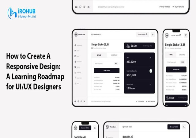
Have you ever stared at a design for minutes and wondered about the efforts behind it? It takes hours and sometimes days for designers to come up with such interactive designs. UI/ UX course in Kochi today has become one of the most in-demand skills for aspiring designers to get a well-paid job in the city. From the handy mobile screens to laptops and desktops, a responsive design is the main factor that makes a website clickworthy to users. However, the efforts behind is a combination of theories, practice, and a well-built portfolio that makes the website eye-catching by having the necessary UI/UX skills that the profession demands. Also, UI/UX designers with an eye for creativity and a mindset for growth and progress, along with technology, are in high demand across different industries.
UI/UX designing is, however, a time-consuming learning process. iROHUB Infotech is one of the top institutions that assists and guides students to become professional designers through our comprehensive curriculum. This being said, consistency and comprehension are what define the success of a UI/UX course. This blog discusses how to create a responsive design and guides all beginners towards a successful career journey.
What is a responsive design?
A responsive design is an approach that UI/ UX designers choose when the website content and the design adjust and resizes itself to customize itself by any screen size. This saves the designer time and resources for building separate screens for mobiles, desktops, or laptops. A responsive design helps web developers, designers, and visitors from resizing the website manually to match their comfort zone. Altogether, it helps the users get a non-parallel experience while visiting a website.
Reasons to Learn Responsive Web Design
More than UI/UX designing, responsive web design as a module is gaining popularity amongst UI/UX designers. Here are the main reasons why you should learn more about it:
Better user experience
Rather than causing difficulties for users to adjust their screen sizes, learning responsive web design practices makes it easy to deliver a better user experience. This makes the websites look more professional and standardized. It also assists in adjusting the text sizes without having to manually change them according to the device type. Lighter, user-friendly layouts also increase the page speed and visibility. On the whole, it improves usability and accessibility.
Brand consistency
Learning to create responsive web designs helps you deliver unique, competitive, and user-friendly brand ideas. In other words, the screen transitions, effects, and dropdowns become more effective when the web design chosen is a responsive one. As a result, it becomes easier to choose the same for omni-channel marketing without creating much changes to the existing website. Also, it reduces unnecessary screen zoom in and zoom out, making the brand consistent in terms of presentation. The best part is that with responsive design, the website can be changed to any extent, any time in the future.
Future scalability
As a responsive design comes with a unified codebase, it becomes easy for the developer to implement design changes on any device. Also, the RWD principles ensure that the customer screens easily adapt to any screen size and can switch effectively. The SEO search engines also choose responsive designs to rank, as it only allows one URL per page.
Higher conversions
Responsive designs don’t leave the users frustrated as they are fit to the screen size and quick to respond. This largely eliminates the website bounce rates. Also, since most users prefer to visit websites through mobile devices, there is a higher rate of conversion than those who visit the website on bigger screens. Another reason for high conversion rates through a responsive design is that it allows users to fill forms and details without exiting the main tab. Moreover, with the majority of user information being stored and used on different applications, even on big and small screens, responsive designs auto-fill them, increasing the conversion rate by far.
Practical learning
An added advantage of learning responsive design is practically understanding the concepts and implementing them into projects. It focuses on concepts like Core Web Vitals, the layout, and other academic concepts. It also teaches students how to make the content optimized for mobile devices without hindering the user experience. AI-oriented designing tools like DevTools guide with immediate debugging and testing. This means that choosing a responsive design course is worth your time as you get to learn the practical aspects thoroughly.
Industries that Demand Responsive Web Design
There are plenty of industries that demand designers who have deep knowledge in responsive web design, such as:
E-Commerce
Designers are in charge of making the digital storefront accessible to customers through their responsive web design. The designed layouts and builds help them zoom in and zoom out to read and decode the designs without technical knowledge. Some of the exclusive services you may have to provide, being a part of e-commerce designing is designing the carts, the payment gateways, and the navigation. This makes the website more visible and crawlable on search engines. The biggest save here is that designers needn’t build different app versions across the country. Instead, you may simply implement a responsive design to experience the best design impact. For example, an online clothing brand can attract customers with its color combinations, fonts, and branding styles.
Health
Again, the healthcare professionals use apps and websites on different screens through a mobile app development firm. Having a responsive design ensures that the design is uniformly appealing on every type of screen. These designs are adaptable for mobile screens so that the patients can find their information in a neat and well-structured format. Secondly, the bookings and call buttons are highlighted well enough to serve the needs of the users. It also helps in putting up the reviews and patient feedback as pop-ups ensure instant patient communication and feedback. These designs also integrate accessibility compliance, whereby the platform becomes easily accessible to the impaired through converting the content in the like manner. For instance, A neatly designed hospital website helps patients make their bookings and get consultation receipts online if the design is simple enough.
Finance
A responsive web design is more important in finance than in any other sector. Here, the designers make sure that the diagrams and charts are clear and communicate when compared to all other website types. Also, it decides which information is more important to users, such as log-ins, log-outs, transaction histories, and rewards. Also, in emergencies, it should help users navigate through the buttons and complete transactions in a matter of minutes. Essentially, it must not make the shift from one page to another obvious, but rather smooth. Let’s say a user should take the same speed to log in and log out of their banking app without potential hangs.
Travel
If you’re planning to become a UI/UX designer in the travel industry sooner or later, you should primarily know how to design websites that are simple to access. Make sure that the bookings and itinerary management can be easily seen upon opening the app. Also, you should know how to add ‘auto-fill’ options to confirm that there are no repetitive errors when filling out mandatory details. You should know how to add mandatory features like an emergency button for calls or messages to ensure that users can connect with the authorities during emergencies.
Tips to Choose the Right Institutions to Learn Responsive Web Design
Here are some quick tips that help you choose the right institutions for you to learn responsive web design:
Go through the curriculum
Read what the course curriculum covers. According to the curriculum, research on the available responsive web design courses can guide you through the industry demands and help you master the core and necessary concepts through their modules. Get to know the languages, tools, techniques, certifications, and opportunities you would be given through the institutions you choose. iROHUB infotech provides a comprehensive curriculum. Understand the frameworks, design, and flow covered, and make the most of it as you enroll in the courses.
Understand the project exposure.
No courses are complete with theoretical knowledge alone. They should be equally balanced with practical knowledge to make it seem complete. Hence, it is important to understand the project exposure your course provides. The course provider must inform you about the real-time requirements, challenges, and technologies used, and how organizations complete them with the available resources and technology. Go for courses that give live and interactive project exposure, allowing students to practice the theoretical knowledge, boosting student confidence.
Check reviews and ratings.
One way that you can rate the course you choose is by checking for their ratings, testimonials, and feedback. For this, you can visit the course provider’s website and check the social proof that has been uploaded. Also, understand the mode of their teaching, whether online or offline. Successful responsive design courses are made available both online and offline for easy accessibility. See if the course provides enough exposure with live and hands-on experience, which strengthens your possibilities getting placed. Institutions that provide free workshops and camps to boost the students’ knowledge and confidence.
Go for suggestions
Don’t be in a hurry to join a course due to a shortage of time or being too costly. Go for courses that meet your long-term career goals and benefit you with challenging or senior roles. Suggestively, choose a course that is more interactive than recorded, where students can raise their doubts and clarify them on the go. Search on expert user communities such as Quora, Reddit, and LinkedIn, and read through answers written by experts to make sure that the best is chosen.
Step-by-Step Roadmap for UI/UX Designers to Create Responsive Design
This step-by-step roadmap is the adaptable process you can follow to create a responsive design:
Step 1: Familiarize yourself with the Grids and Layouts
Since you are learning to create a responsive design, understanding how they work is important. Learn the basic differences between fixed and fluid layouts, where the designs can be sized and stay the same. Understand which layouts fit which type of website and experiment with the different images. Also, learn which types of designs fit what kind of screens.
Step 2: Expect roadblocks and media queries
Some of the expected roadblocks in responsive design are text overflow, slow networks, and creative blocks. There could also be spacing issues where the design could be squeezed onto a small screen or stretched to a bigger size, where the entire look and feel of the website is lost. Media queries are the rules that apply styles conditionally based on device characteristics. Plan on what devices the responsive designs would be viewed or used, such as mobile phones, tablets, desktop computers, or laptops. Deciding on these factors reduces the time in resizing or redoing the creatives.
Step 3: Implement mobile-first design
Mobile-first designs are designs that are first tested on mobile devices and then scaled up to laptops or desktops. A few elements contribute to a great mobile design. One of them is the content inventory or features. Make sure that you decide on which are the nice-to-have and necessary features. Similarly, keep in mind that you choose a thumb-friendly design that is easy to zoom in and zoom out conveniently. Also, make the tap-worthy icons a bit larger so that they’re findable and make the users click on them immediately. Design images based on a pre-planned mobile, tablet layout.
Step 4: Design editable components
One of the essential features of a responsive design is having editable components. Some platforms, like Material Design, help create interactive designs and assist with editing, applying, and replacing them when required. Add edit indications for editable components. Design the icons in a way that the users understand them to make good use of them. If you are designing for a niche, ensure that you maintain a design library where you can edit and reuse designs. After setting up the library, confirm that the editable components match the user behaviour.
Step 5: Look for the best navigation patterns
Navigable patterns decide the look of the website. To create such patterns in your app or website, start by researching the best patterns; you must understand the Informational Architecture of your website. Hence, start by understanding the core navigation patterns and which would suit what type of website. Then use the best navigational prompts to connect a user to the information they’re searching for with the right menus and dropdowns.
Step 6: Practice on different design tools
Look for the best free tools that offer responsive designs. Spend enough time understanding the functions and practice them as and when you find time. This makes you more confident in using them in your workspace and taking up more projects in a similar niche. A UI/UX design course in Kochi or your specific location makes you practice the tools that are of demand in your local job industry.
Step 7: Test on real devices
Test the responsiveness of your design on both iOS and Android devices, making sure that they’re functioning well on both. Also, analyze how convenient it is for real-time users to use and interact with the designs. Third, confirm the technical parameters like the resizability, the compressibility, and the adaptive navigation that make you find the features in a matter of seconds. This test decides whether your website is usable or just another choice.
Step 8: Connect with developers for suggestions
To mark the responsive design a success, connect with the developers and ask them for real-time feedback. According to Wikipedia, design thinking and design principles shared through curriculum and coworkers leads to design success. Ask for suggestions on success rate, user satisfaction, the total ROI, and the investment required to meet the design outputs. Make sure to be precise when communicating the requirements to developers to get an idea of how your design output would look.
Step 9: Run a Usability test
A usability test is proof that the users easily adapt to the designs. You can do this by asking your real-time users to make immediate searches, monitoring the broken links, clicks, and legibility issues. Start by identifying the underlying problem in designs, and choose the necessary tools like Figma or Maze. Then, choose two or three users who are willing to test the design, ideally two or three team members who are unfamiliar with the app and its features. While testing, make sure to follow the ideal practices that make the design impactful and successful.
Step 10: Add to your portfolio
Rather than simply adding your works as a portfolio, you should ideally go for a well-researched format that makes it look exciting. Start with a well-written introduction that mentions the reason and importance of why you chose the design. Then, explain the process you followed to create the design and the tools you chose for creation. Next, include the prototypes that could help your hiring managers to go through the designs. Instead of simply adding static images, add graphic or drag-and-drop elements that make your project look interesting.
Conclusion
A responsive web design is one of the strongest pillars of a website that keeps the target audience hooked and converts them into leads. Following a structured development and design learning outline helps you learn the core concepts of the profession and attain a notable job role in your anticipated time frame. The key to a reputable role is not just learning the academic concepts through a well-designed course, but also investing sufficient time in researching and upskilling. All set to level up? Stay updated on the latest trends and technologies to settle down with your dream UI/UX careers.
FAQs
How do you create a responsive design?
Your design is called a responsive one if it easily adapts to any screen size, has a responsive viewport, fluid layouts, and CSS queries.
Why is a responsive design important?
A responsive web design is important because it ensures a uniform look and feel of your website across all screen sizes. It acts as a catalyst in boosting your website’s visibility and driving more website visitors to stay on the website.
How does a responsive design work?
A responsive design works by becoming flexible to any device, making it easy for users to switch between devices, delivering a unique user experience.
What are some of the breakpoints of responsive designs?
Some of the breakpoints of responsive designs are the screen widths and the user’s screen size.
Post Comments (0)